Fastcase Website Redesign & Style Guide
Client: Fastcase
Project Overview:
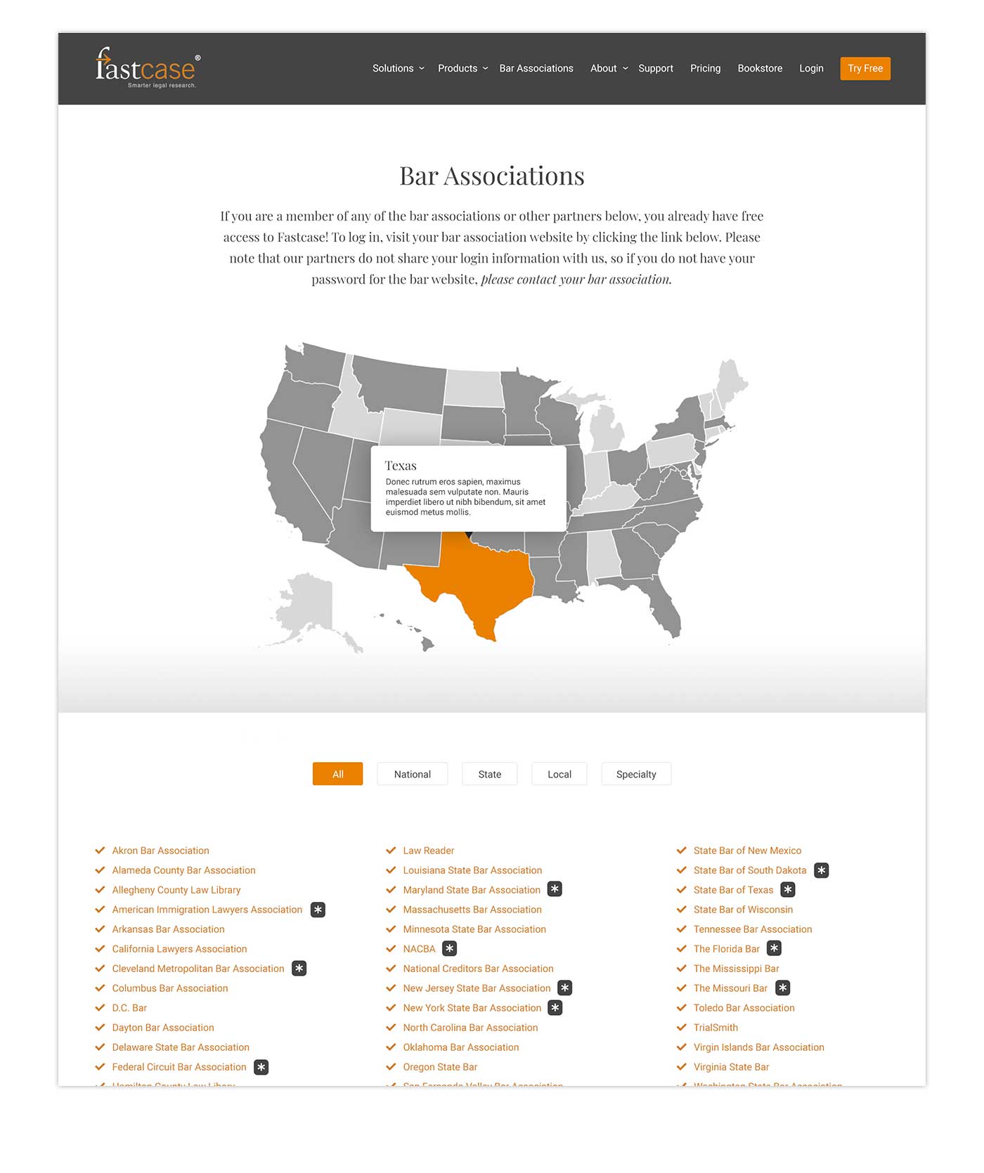
The Fastcase website redesign project involved a comprehensive overhaul of the Fastcase.com site, focusing on enhancing design elements to create a more visually appealing and cohesive user experience. Initially centered around functionality, the redesign shifted to emphasize stronger design elements, allowing Richmond Concept to introduce a more refined aesthetic to elevate the site’s overall look and feel. The project aimed to develop a digital style guide and redesign key pages to attract new prospects and subscribers while maintaining a unified branding approach.
Objective:
The primary objective was to enhance the visual design of the Fastcase website, creating a cohesive and professional aesthetic that aligned with the company’s branding goals. This included developing a comprehensive style guide encompassing fonts, font sizes, colors, borders, and other design elements. The redesign sought to differentiate between various page types, establish a template system, and ensure a consistent, polished appearance throughout the site, particularly as Fastcase aimed to integrate multiple brands under its umbrella.
Design Tools and Techniques:
Richmond Concept utilized a variety of design tools and techniques to achieve the desired outcomes for the Fastcase website redesign. Key elements of the design process included:
Digital Style Guide Creation: We developed a digital style guide to define the visual elements for the website, such as headers, footers, buttons, fonts, colors, and icons. This guide provided the foundation for all design decisions, ensuring a unified look and feel across all pages.
Page Template Differentiation: A system of page templates was established to streamline the redesign process. This involved categorizing pages and developing templates for each type, enabling a more organized and efficient approach to the redesign of the 47 pages involved.
Brand Integration and Color Strategy: The redesign incorporated a more artsy design touch, inspired by Intuit’s branding approach, to create a cohesive aesthetic across all Fastcase products. This included integrating more blue and orange tones to align with Fastcase’s visual identity and distinguish its various product lines.
Website Audit and Sitemap Development: An initial website audit was conducted to assess the current state of the site, followed by the development of a new sitemap to better organize and categorize pages. This helped establish a clear and logical structure for the redesigned website.
Execution:
The execution phase focuses on applying the new design elements consistently across the site, with particular attention to key pages such as the “Solo & Small Firms” page. Steps include:
Collaborative Feedback and Iteration: Ongoing collaboration with Fastcase to incorporate feedback and refine design elements. This includes revisiting problematic pages, like the bar association page, to improve their presentation and usability.
Focused Redesign of Key Pages: Starting with selected pages, such as the “Solo & Small Firms” page, the team is making adjustments to styling, fonts, colors, and spacing to enhance professionalism and visual consistency.
Template System Implementation: Establishing a system of templates for different page types to ensure design consistency and reduce time spent on repetitive tasks during the redesign of all 47 pages.
Tools Used:
- Adobe XD
- Figma
- Adobe Photoshop
- Google Sheets (for collaborative feedback and documentation)
- Fastcase’s existing icon set and branding materials


