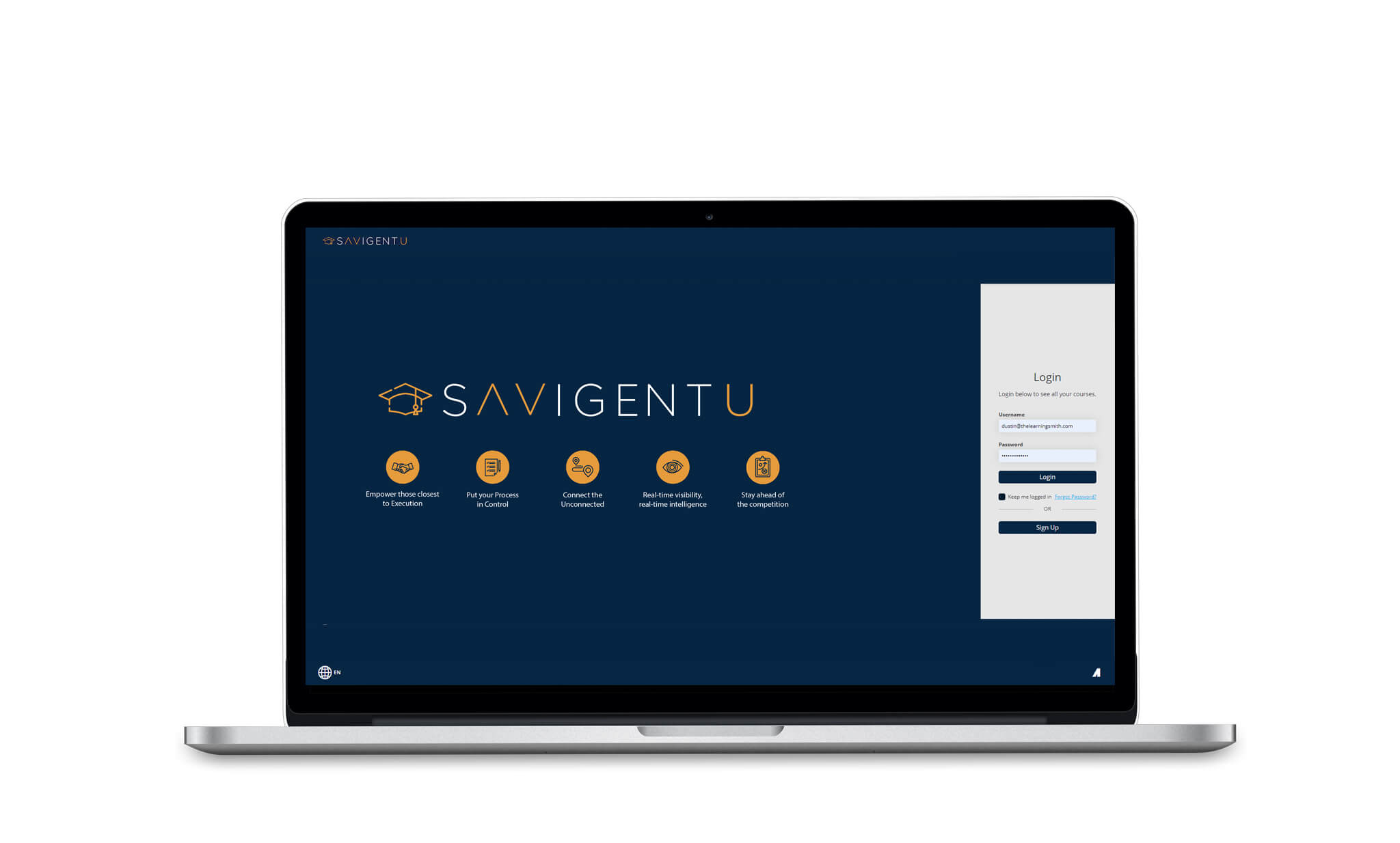
Savigent Software Logo and Brand Elements
Client: Savigent Software
Project Overview:
Richmond Concept was engaged to design a comprehensive suite of graphics for Savigent Software’s new training website. The client sought a consistent and visually appealing set of designs that align with their corporate standards.
Objective:
The primary objective was to create a set of graphics that visually represent Savigent Software’s brand while ensuring consistency across various design elements. The deliverables included a logo, fav icon, thumbnails, banners, and a splash page image. All graphics were to adhere to the brand’s colors and fonts.
Execution:
Richmond Concept collaborated closely with Savigent Software, working within the constraints of the existing branding guidelines, which were derived from the company’s website due to the absence of an official branding guide. The design process included iterative feedback and refinement, ensuring all graphics met the client’s expectations and adhered to the brand’s visual standards.
Outcome:
The final set of graphics effectively established a cohesive visual identity for Savigent Software’s new training website. The logo, fav icon, thumbnails, banners, and splash page image were consistent with the brand’s aesthetics and enhanced the overall user experience. Richmond Concept’s attention to detail and design expertise ensured the graphics were not only visually appealing but also enhanced the overall user experience and most importantly complied with the company’s existing brand standards.
Tools Used:
- Adobe Illustrator
- Adobe Photoshop


